Cursor

mode

Language Support

logo

Case Study
Swissnex

How might we improve the swissnex user experience and meet business goals?

swissnex is recognized globally around the world but unless you are part of their community it was challenge to know what it is they do on their current website. Swissnex did not have consistent branding, design systems or nomenclature on their sites across the world. The site was also very difficult to navigate and most users ended up emailing to get the information they were looking towards. The business goal was to create a better user experience that generated more connection within their network and engaged with users more at their events.

  • + 1-Year Project
  • + Global Team
  • + My Role / Lead Product Designer & Strategist
  • + Goal / Elevate the Experience, More with Less, Make it Customizable
  • + Purpose / Redefine the Site, Shift the Focus, User-driven, Amplify the Narrative
Awesome Image
 
Vision

To modernize the site while creating a consistent look & feel with ease-fuse experiences and allowing for delightful discovery.

Scope & Constraints

The scope of the work spanned across Switzerland, Brazil, India, China, San Francisco, Boston & New work. It was a complete branding and product software redesign and migration with a budget of 50k.

Users & Audience

The users and audience were minimal at the start but we generated 36 personas globally that needed to be designed for within unique content information and experiences.

Challenge

The challenge was working with different countries that have different requirements for their users, technical feasibility and local aesthetics while creating a cohesive system that was easily recognizable for users.


Helping swissnex own their narrative while intersecting with user discovery by creating compelling journeys.


Flexible design consistency

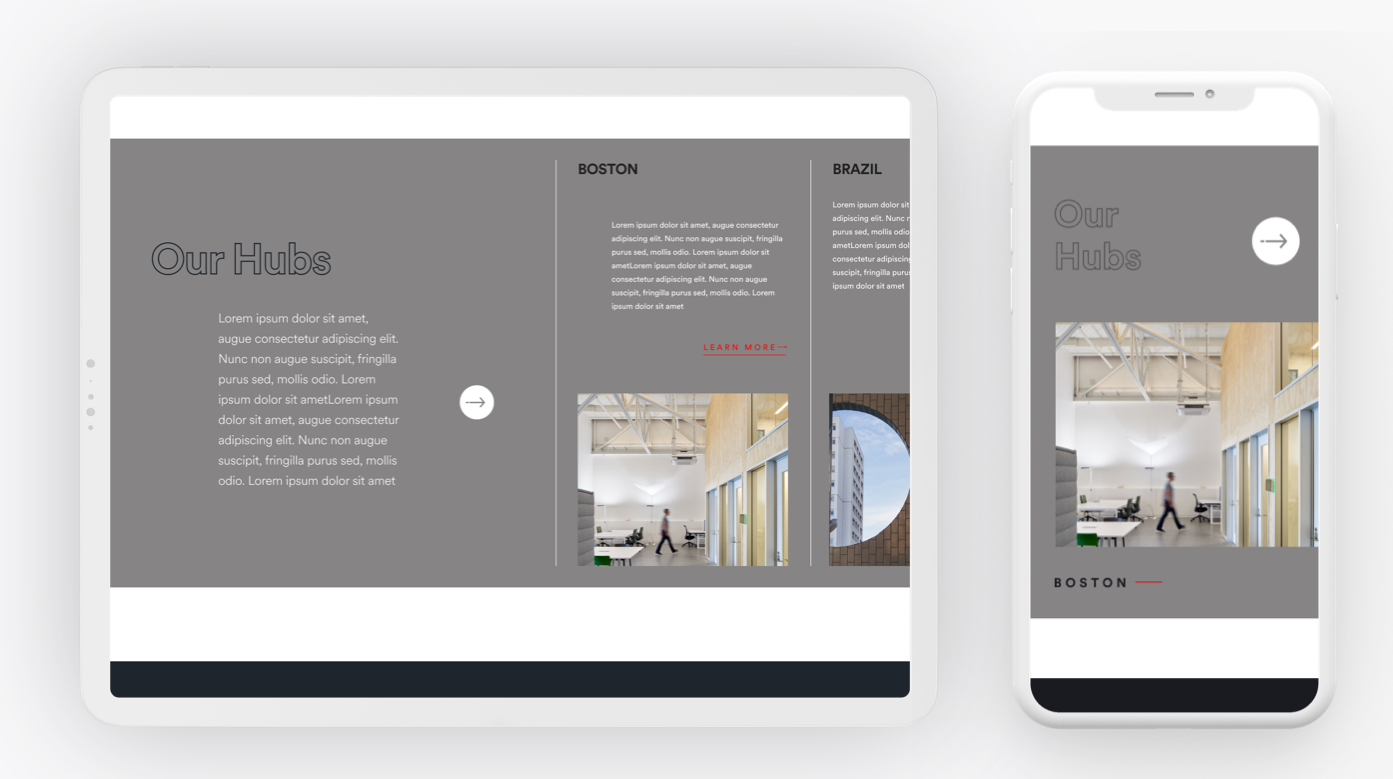
The approach to the revised Site IAs is to create a global navigation that is flexible and can adapt per market within the network. The core principle is to create nomenclature for the site architecture and consistent communication principles that enhance the user experience while providing familiarity within a structured design system. This allows for the navigation to scale and flex based on the locations core focus areas.

Create a template based system.

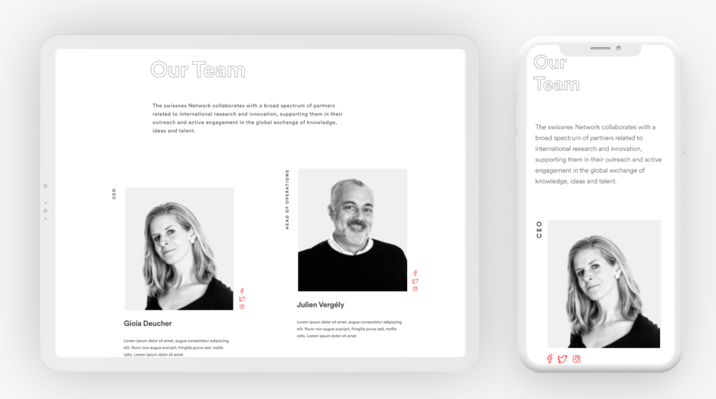
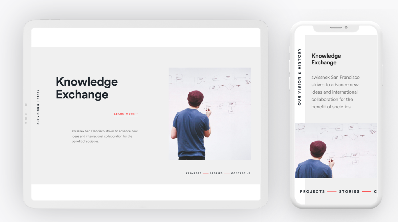
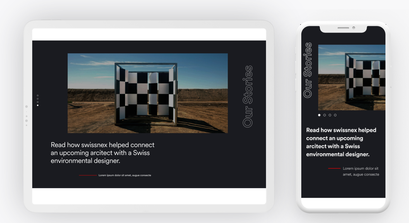
We identified 33 core pages and naming conventions to have an organized system. Within these templates there will be components that allow for customization. These were created in partnership with a development team in France who did the build based on my designs.

swissnex Before

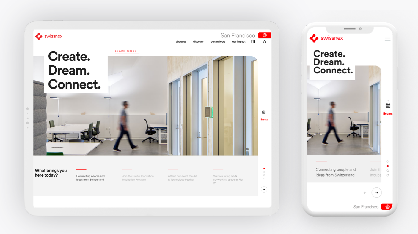
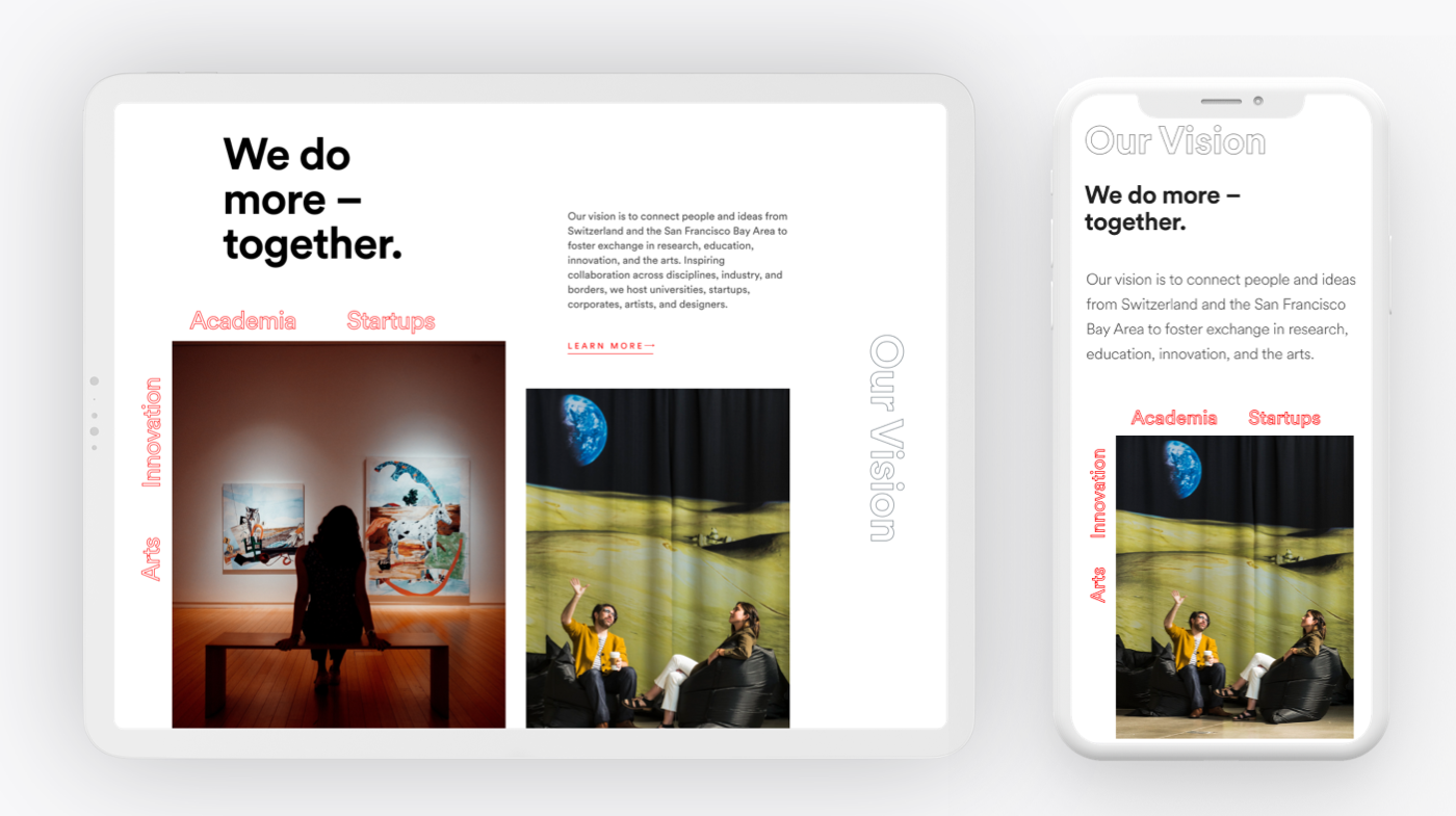
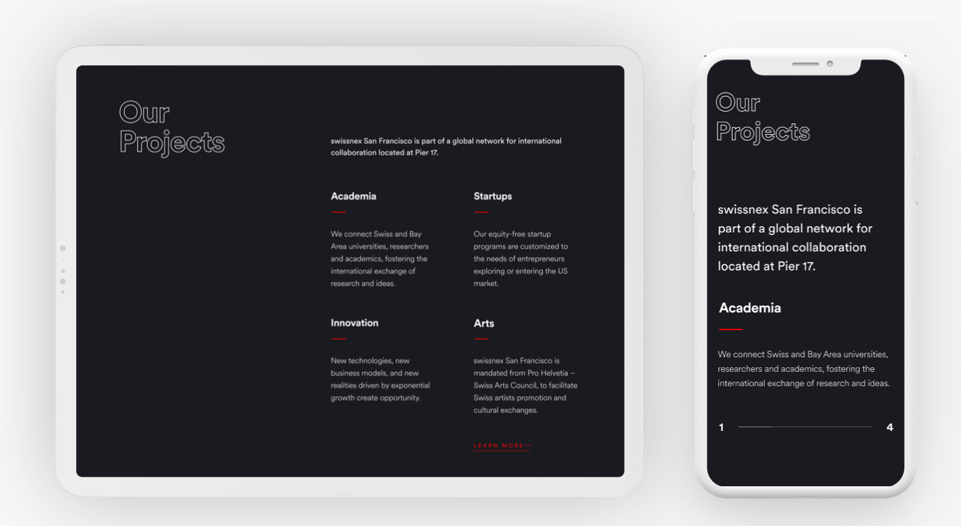
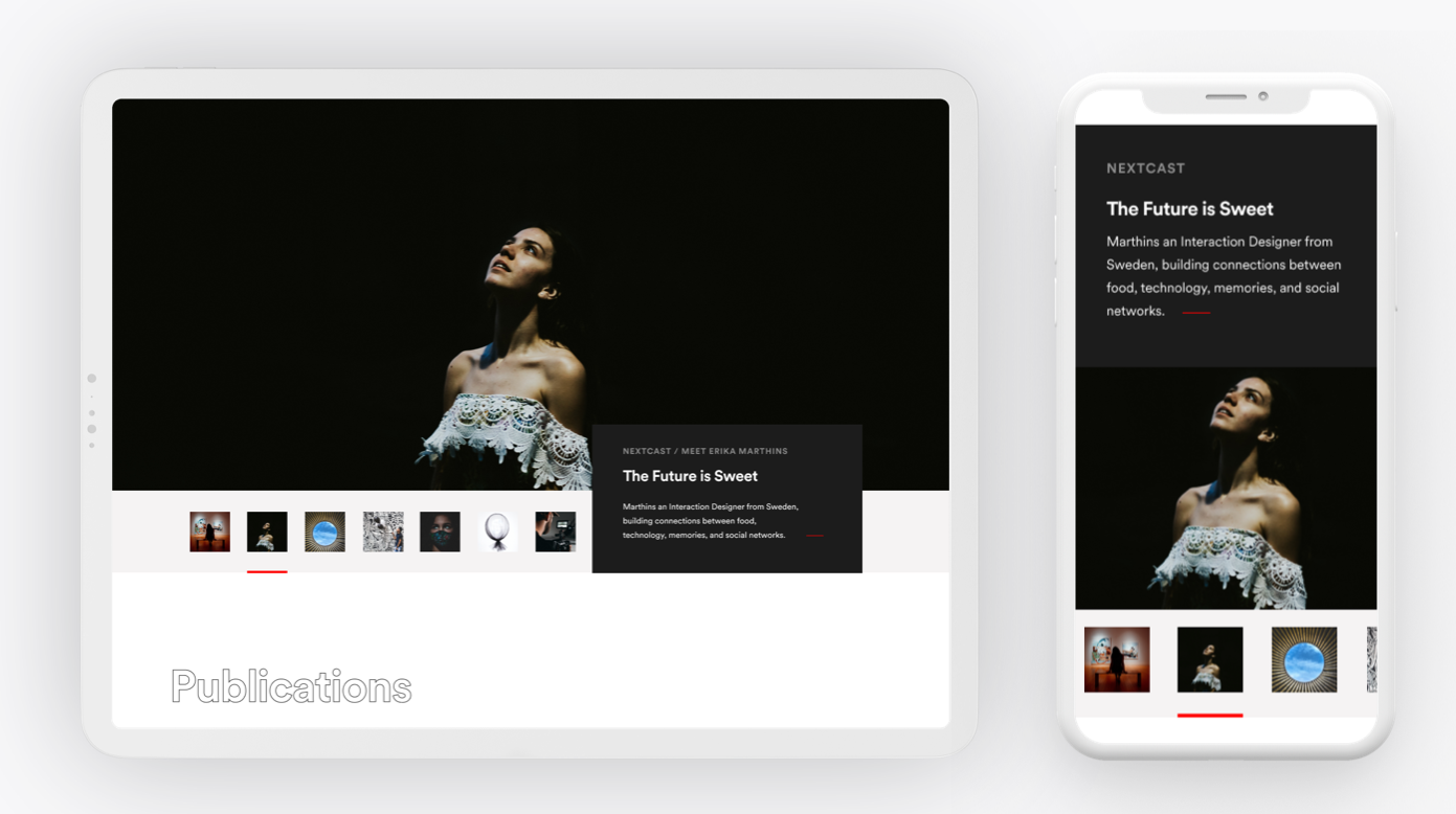
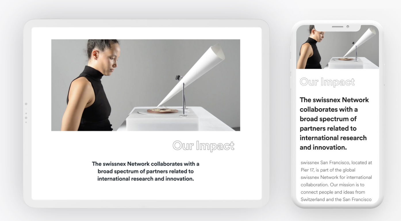
Final Designs

What the UX Accomplishes

Ease-of-use Navigation

  • Clean and simple navigation that creates easy to understand and informative sections of the site for the user to find information.
  •  
  • Well-planned architecture.
  •  
  • Limited number of navigation items that creates a clutter-fee experience.
  •  
  • Provides users with confidence to know where they are and what information they can receive from your website.
  •  
  • Easily divides categories and sections of the site clearly.
  •  
  • Simplifies the complex network of information and resources that are available to users from swissnex.

User-friendly

  • The modern and clean design of this layout allows for straightforward and quick access to common information and exploration.
  •  
  • Informative header and footer.
  •  
  • Graphical elements that create CTAs that are easy to recognize as links.
  •  
  • Allows for users to explore and learn.
  •  
  • By including white spaces between paragraphs/around text blocks, it actually make users understand what they are reading.
  •  

Organized Simplicity

  • The layout is organized and intuitive that requires minimal explanation on how to find information.
  •  
  • Well-formatted content that creates informative visual hierarchy.
  •  
  • Showcase images for mobile sliders and swipes.
  • Builds focal points.
  •  
  • Less is more mentality.
  •  
  • Simplifies the complexity of content.
  •  
  • Showcase what is truly important to the users not an overwhelming amount that has them bounce.

Functional Funnels

  • Users want learn how to work with and collaborate within the swissnex network.
  •  
  • Clear user priorities.
  •  
  • Optimal placement of content.
  •  
  • Support the purpose of swissnex.
  •  
  • Elevate empathy and discovery.
  •  
  • Guides users with impactful information discovery.
  • Provides designs that create functional CTAs to important content.
  •  
  • Convinces the user to connect with swissnex by providing key information within three clicks.